Office 2007 interface
 I have to say that I have been using the new Office offering from Microsoft and I am not particularly impressed. Functionally, they seem quite capable, and add a number of new features to the older versions, at least I would hope. The main complaint that I have is that the interface seems to have fundamentally changed.
Now I could go on about the interface in Windows alone, but despite its flaws, people have become quite familiar with it. There is a window, be it maximized or otherwise, and under the familiar title bar is the familiar menu bar. Familiar things live in that menu bar, like “File” and “Edit”, and whether or not that menu is always useful or appropriate, if it exists, it is pretty much in the same spot. Enter Office 2007. I’m not sure what the plan was there, but it seems that they have decided to scrap the menu bar altogether and instead created a set of adaptable tool bars, grouped thematically. They call this new interface element the “Ribbon”.
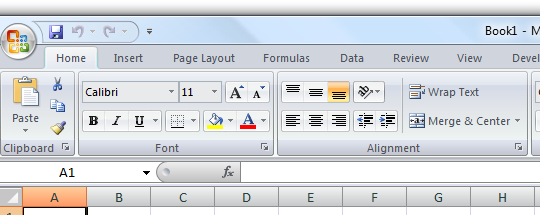
In the screen shot above, I am in the “Home” ribbon, I guess. And don’t let the ribbon names throw you, they are not menu items, although they are in the same spot and look very much like they could be. I’m not arguing with the grouping situation, because the same problem existed with menus, but obviously this is a fundamental change in the implementation of them. What is the most problematic in my eyes is what happens when you resize the window, or move from one computer to another with a different resolution. This ribbon is an adaptive creature and will change itself to fit the horizontal space it has available. To do this it will change the sizes and position of the contained buttons and options. You can’t see this from my screen shot, but it is a huge concern when the interface can change so radically on you.
Granted I am no expert Office user, especially Excel which has been what I have been using the most at work, but there were a few things I new how to do. Trying to find out how to do those few things was a chore. I spent many minutes studying the various ribbons and only on my second pass through did I notice one of the features which was relatively tiny on my screen. At one point I thought maybe the feature didn’t exist, and I was going to try a quick search of the help file, but – oh wait – where is the help menu? It turns out it is at the far right side with the window controls (close, maximize, minimize buttons).
Perhaps in the long run, this method will please more people. I’m sure it wasn’t done on a whim, but I really can’t see the value in it yet. It almost feels frustrating using this impotent software interaction when all the other programs I use are, if not familiar, familiar behaving.