Font Quest

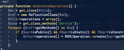
The Inconsolata font in use within TextMate.
Recently I have been on a quest to find the best font to use while programming. This is one of those things that a lot of developers overlook when setting up their workspace, but it can make a significant difference. We will tweak key bindings, and colour schemes for hours to get the perfect mix, but then we will continue to use the default font for the editor. In windows this means Courier New or Lucida Console maybe. On a Mac, the usual suspect is Monaco – which in all fairness is a very nice font, but is it the best one for you?
I certainly can’t tell you which font you should use… that is clearly a personal choice, but I can point you to a couple of ones which I have enjoyed using in the past. I also realize that this isn’t really about Europe per se, but I am over here working on a dissertation project, staring at a lot of code and therefore this becomes an important issue. As important possibly as a comfortable chair and a proper desk for ones personal well-being.
- Inconsolata – this is my current choice. Apparently this one looks very nice printed as well which may well be important when it comes to preparing my dissertation paper. The only drawback as a screen programming font is that the digit zero isn’t slashed or dotted. Some people require this… so far I’m OK with it.
- Consolas – a Windows Vista font that is designed for use with their ClearType rendering system. It seems to work quite well on a Mac, and it has a nice italic version as well. I haven’t used it but I compared it recently to Inconsolata and chose the latter.
- Anonymous – A modern incarnation of a font developed 10+ years ago. This is the font that I used prior to now, for a number of months, without any problems. Nice slashed zeros, the lowercase ‘a’ is the format that can look a bit like an oh (o). The largest hang-up I had with it was the tilde (~) – it was set very high and looked awkward sitting next to a forward slash (/) which is where it usually appeared. Otherwise, well worth a look.
- Bitstream Vera – these are open-source fonts that have a lot of appeal. There is more than just a monospaced font available, this is more like a package of fonts, but they are free and well worth a look.
- Pragmata – this is one nice looking font. The only catch is that it costs 90€, otherwise I may be using it now. I’m seriously considering this font anyway, but I suspect I’ll hold off until I have more disposable income. If you don’t find a free alternative that suits your needs, this one may. Take a look.
- Proggy Fonts – again, this is more of a collection rather than a single font. These fonts are more compatible with Windows than with Macs, and aren’t meant to be anti-aliased. They are also quite small and if you like to work with larger fonts, this isn’t going to be much use. But they are popular with a number of people so I thought I’d mention them.
There are more available, some pretty nice, some quite ugly, but again that is a personal taste decision and I hope that you find something that is as pleasing as possible for you to work with.