
Everyone needs a font
Taking a bit of a break from static site related matters to something with a bit more mass appeal. Maybe. :)
It doesn’t matter if you are writing JavaScript, C#, Rust, Python or tomorrow’s trendy language, as a developer, everyone needs to get characters onto digital paper. And typically you do that using some sort of editor, rendering those characters using a particular font.
And yes, you could use Courier, or Monaco or whatever else comes with your system. But developers are opinionated, particular, and often eccentric creatures so I’m sure you have a favourite. If you are like me, that might be a favourite of the moment, always looking for something a bit different to make life more interesting. I admit, I might be a bit more into fonts than the average developer.
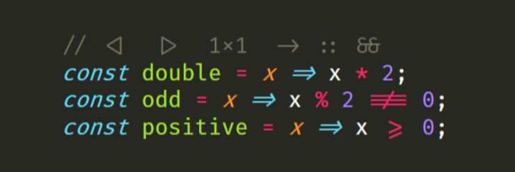
So I’m not going to present you with any old programming font. These fonts all contain ligatures of common programming symbols. In typography a ligature is a character consisting of two or more joined symbols. I think a picture is definitely worth a thousand words here.
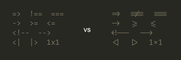
Unlike normal ligatures, programming ligatures are the geeky version which allow the symbols we type for coding purposes to look better. Of course better is subjective, as is everything around fonts, so feel free to continue searching if one of these free options below don’t suit you.
Also, it is worth noting that your text editor of choice needs to support ligatures for these to work. Most do these days, thanks in part to these fonts. The Github page for Fira Code below maintains a list of supported tools with instructions for setup in some cases.
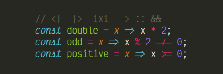
Victor Mono
Victor Mono is a free programming font with semi-connected cursive italics and symbol ligatures. It was created based on the author’s inability to find a suitable alternative. It is lighter weight than the others here and has a large x-height. And while I like cursive italics, the implementation here doesn’t look as nice as others I’ve seen. Not my favourite, but a new one on the scene which you may not have seen before.
https://rubjo.github.io/victor-mono/
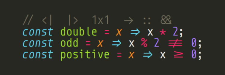
Monoid
Open source and free, Monoid tends to run quite large for any given point size. The images for all fonts here were taken using the same size. Monoid can look a bit tight with a lot of code on each line because the characters are so big, the lines are tight. I never found it to be an issue, but some might. I still use Monoid in Visual Studio.
https://larsenwork.com/monoid/
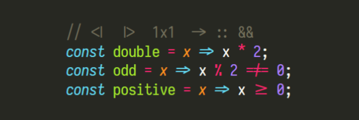
Iosevka
Another open source option, Iosevka is the one I’m currently using, at least on Windows. This one is under active development it seems. It also comes with a number of variants regarding certain characters you can choose from: slashed or dotted zeroes, one or two story ‘a’, etc. There is also a specific terminal version and a slab serif version.
Fira Code
I can’t say if Fira Code was the first on the scene, but it has certainly become one of the most popular. It is based on Fira Mono, and supports a lot of ligatures. Feels a bit more polished than some of the others. I like using it on my terminal.