Typography geek
 Sometimes you just have to admit your are a geek in yet another domain. In this case it is typography. I’ve always been a fan of the written word, and I’ve had an eye for fonts and other typographical elements. It wasn’t until recently however, when setting up TeX on my new iMac, that I realized that the thought of typesetting a document excited me. It left me with a warm and cosy feeling inside. That the actual shape of letters could affect my well being. I’m pretty open to both the use of type as a design element and document design in general. Both vastly different areas with different rules and guides, but both concerned with typography in general.
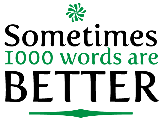
As anyone who follows the font world knows, fonts can be expensive. I say font, as opposed to typefaces since in some case, individual fonts from the same typeface are sold separately. However, there are some great free fonts available out there as well. One that I came across recently is Fertigo Pro, which is what I used for the above design. It makes a great title font, and a unique looking body font. I used it for both in a recent newsletter that I created. There is a decent list of free fonts compiled by Vitaly Friedman which are actually usable, as opposed to those free font sites you find which offer a range of somewhat useless fonts. Sure there might be a justification for writing a message with flaming letters, but it is kind of gimmicky.
How does this affect this site? It likely won’t other than the increased number of posts which I expect will be about fonts, type and other related design elements. If anyone has any nice font they know about which are free (or definitely worth the cost) please post a comment or something.